In the Shadows of Killing and Dying: I Got to Know Adrian Tomine's Work for All the Wrong Reasons
I haven’t taken an art class since I was in 8th grade, and I don’t know piddly about what I’m doing in my illustrating life. But nowadays there are things like YouTube and public libraries to teach you just about anything under the sun, so if you want to learn a new art skill (which I do! lord I do!) then you have nothing stopping you but your own beastly self.
So whenever I go to the Boca Raton Public Library, I generally check out 20-30 books at a time: graphic novels, art books, how to draw books, children’s books—anything with A-R-T-S-T-U-F-F. I manically grab titles off the shelves, often without even glancing inside.
On my most recent visit, I wanted specifically to learn more about shading and to study the various contour techniques of as many illustrators as I could stand. I came home with a sky-high collection, and on a delicious Saturday afternoon, I sprawled languidly across my bed and cracked open the first of my books.
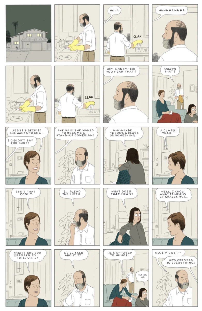
It was Killing and Dying by Adrian Tomine—a collection of six graphic short stories.
But to my horror, there was not a shadow in sight! The illustrations were flat, flat, flat—each page just as flat as the last. I was downright annoyed, but I read on and read on some more.
As the afternoon light aged along my bedroom walls, I found myself falling in love with Tomine’s work. The pages were quiet and distilled, and their sparse movement made the emotional lives of the characters almost speak more forcefully.
© Adriane Tomine
It is easy to see how 19th century Japanese woodblocks have inspired Tomine’s work. Like the Japanese tradition, Tomine avoids using shadows and creates depth through sizing and spectacular color grading.
“Bridge Opening” by 19th century Japanese artist Yasuji Inoue
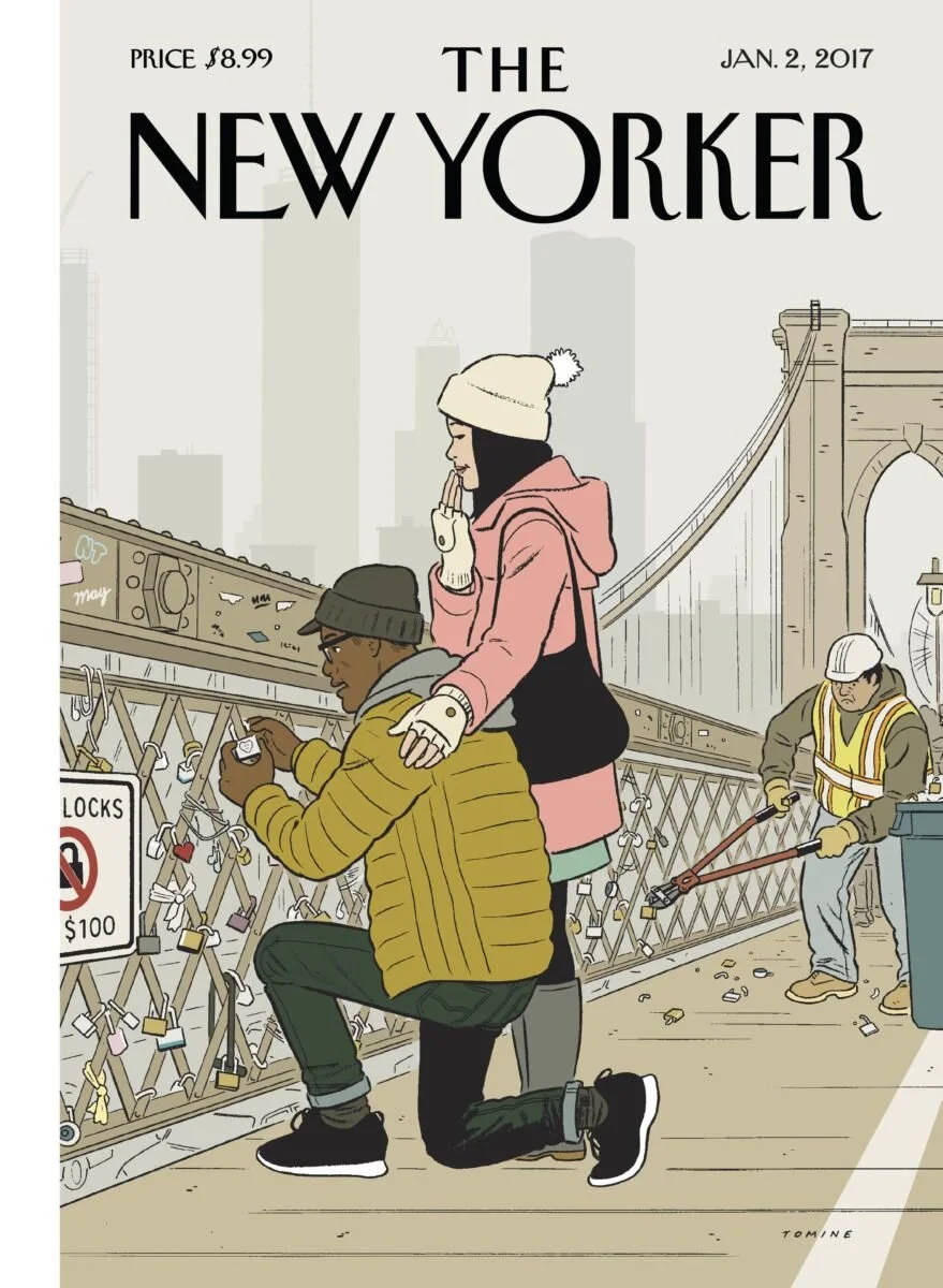
Readers may recognize a few of his many wonderful New Yorker covers. I think they are spectacular.
© Adriane Tomine
While I devoured the illustrations in Killing and Dying, I found the stories to be a little dark for my sensibilities right now. Maybe I’ve been listening to too many perverse podcasts (I have), but I wasn’t in the mood to read about disturbed people with off-color motives. Surprisingly, I did quite love the story “Amber Sweet” about a college student who, much to her annoyance, is mistaken for a popular porn star. This story was a little unsettling, but unlike some of the others, it made the case for a bit of redemption that made it feel soft and optimistic in the end.
xoxo
kate


